Now that altcoin season is upon us again, multiple tokens are witnessing illustrious price hikes every day. In a sideways market, a key skill for a trader is the ability to anticipate when an asset will break out — and when everything is green, knowing when the rallies are coming to an end becomes equally essential.
This week, CELO embarked on a flash rally that generated an almost vertical line on its price chart, but then it quickly faded without ushering in a strong second wave.
Aside from keeping a steady eye on candlestick charts, was there a better way for traders to know in advance when to hop off?
A new DeFi initiative fuels CELO’s price spike
CELO is the native asset of the Celo blockchain ecosystem, whose main goal is to introduce the convenience of decentralized finance, or DeFi, to underbanked smartphone users around the world. A utility token that utilizes a proof-of-stake consensus mechanism, CELO is designed to facilitate transactions and governance processes on the platform.
On Aug. 30, a consortium of DeFi entities — including Aave, SushiSwap, Curve, 0x, PoolTogether and Celo — announced a joint educational effort aimed at raising global awareness of decentralized finance, to which they pledged up to $100 million in grants and incentives.
In terms of the immediate effect on crypto-asset prices, CELO stood to benefit the most from the news, as the Celo platform will serve as the primary infrastructure for the initiative. The coin’s price soared immediately, gaining some 170% within the next 24 hours.
Extraordinary price spikes like this one often end with hard corrections. However, there is always hope for investors that an even more powerful pump is just around the corner. In CELO’s case, however, the first peak at $9 remained the high-water mark, and the coin’s price only went down from there.
Anticipating a price decline
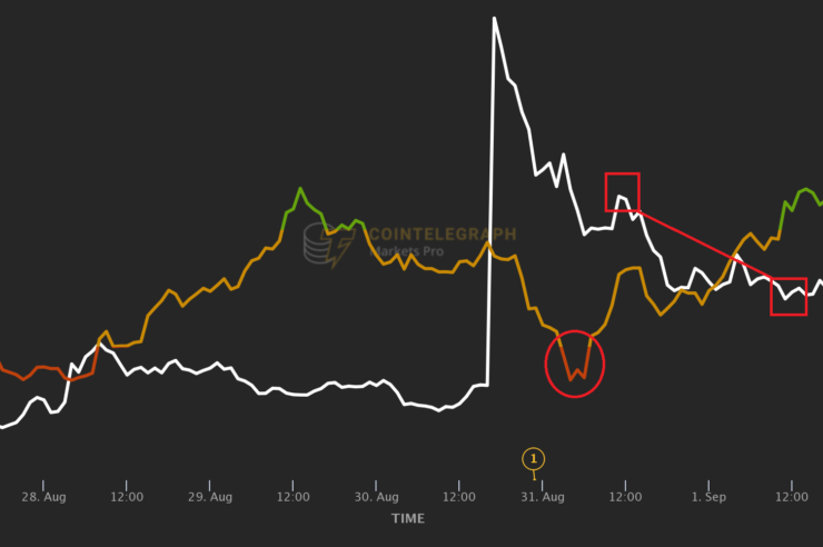
In addition to being one of the week’s top gainers, CELO is also one of the few assets that recorded a low VORTECS™ Score.
The VORTECS™ Score is a machine learning algorithm that compares historic and current market conditions around digital assets to aid crypto traders’ decision-making. Available exclusively to Cointelegraph Markets Pro subscribers, the indicator considers a host of variables — including price movement, trading volume, social sentiment and market outlook — to arrive at a score that assesses whether the present conditions for a given coin are historically bullish, neutral or bearish.
High scores indicate the model’s confidence that the conditions currently observed are historically favorable; low scores, which occur less frequently, appear when the algorithm sees a pattern that in the past consistently preceded significant price drops.

As visible in the above graph, CELO’s VORTECS™ Score dipped into the red zone below 30 when the asset’s price briefly recovered from $7.03 to $7.24 on its way down from the peak value of $9. While this bounce could look like the beginning of the rally’s second leg, historical precedent suggested that the conditions around the coin were bearish.
Traders could use this insight in several ways. Those who had hoped for the price to soar again could be nudged to abandon these hopes and lock in their profits above $7. Another strategy could be to short CELO, wagering that its price would soon return to a downward slope.
As for CELO, the asset soon stabilized in the range between $5.50 and $6, which still represented considerable growth from the $4.30 region from which it exploded during the initial rally.
Cointelegraph is a publisher of financial information, not an investment adviser. We do not provide personalized or individualized investment advice. Cryptocurrencies are volatile investments and carry significant risk including the risk of permanent and total loss. Past performance is not indicative of future results. Figures and charts are correct at the time of writing or as otherwise specified. Live-tested strategies are not recommendations. Consult your financial advisor before making financial decisions.


Comments (No)